Spudnut Donuts

Project Statment

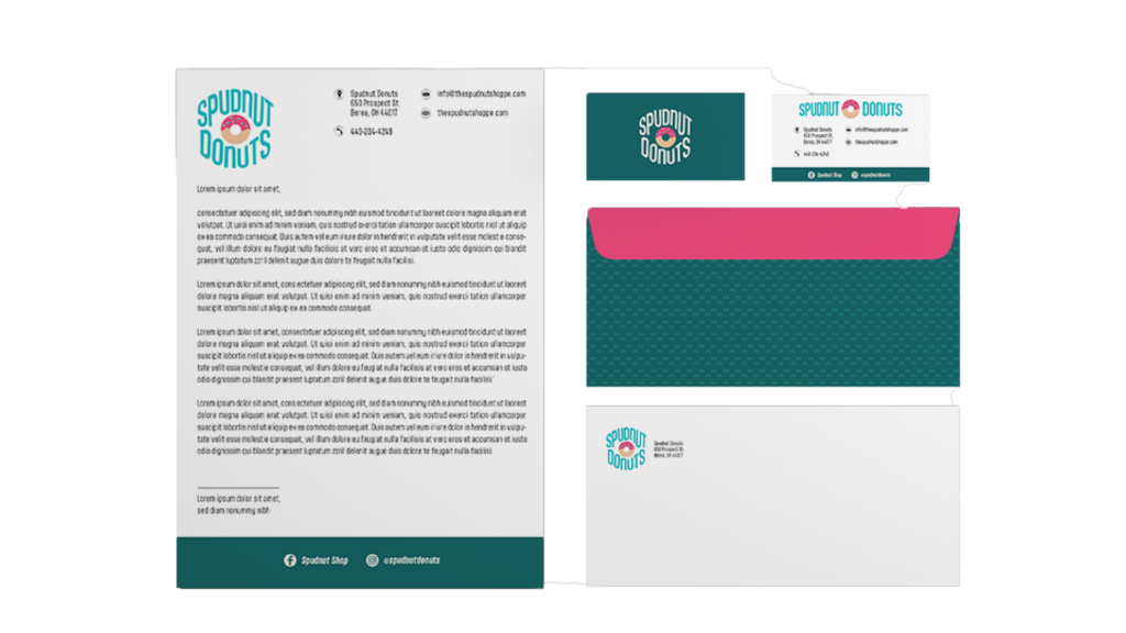
This is an identity rebrand of the Spudnut Donuts located in Berea, Ohio. Keeping in-line with the retro aesthetics, the updated design utilizes colors, patterns, and typography that feel on-brand. The logo now has horizontal and stacked versions with a simplified donut in the center. The font choice for the old logo and design for the mascot were too detailed, and thus were not flexible to be used in smaller formats. The new, simplified logo accounts for that flaw and can be used on multiple formats like coffee cups, donut packaging, letterheads, business cards, envelopes, and more. The white circle around the stacked version of the logo makes it look like a sticker and helps make the apparel and packaging pop.

The legacy of the spudnut mascot lives on as a pattern displays a donut and a bow tie in a cream navy color. This pattern is overlaid across the Spudnut Donuts apparel and packaging to further push that retro aesthetic. To provide contrast and visual balance, cream red is added to selected areas where appropriate.

To compare the rebrand with the old design of Spudnut Donuts, visit thespudnutshoppe.com.

Objectives

Stationery Mockups

Stationery mockups consisting of a letterhead, business card, and envelope.

Stationery Mockups

Custom designed business card for Spudnut Donuts.

#10 Envelope

Custom designed #10 envelope for Spudnut Donuts.

Coffee Cup

Custom designed coffee cup for Spudnut Donuts.

Pastry Box

Custom designed pastry box for Spudnut Donuts.