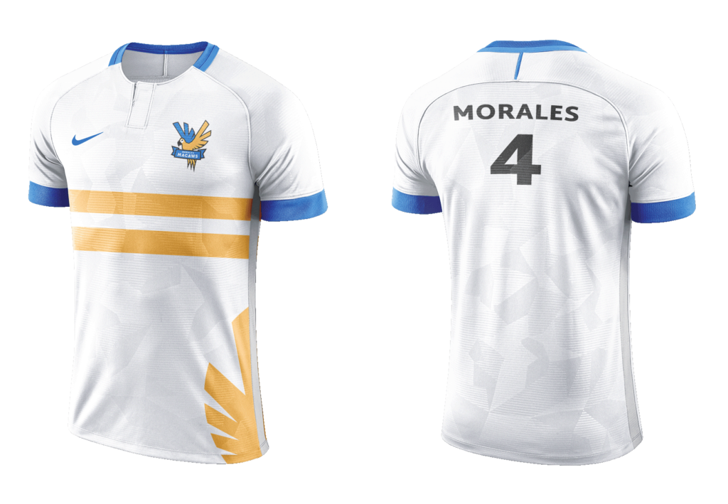
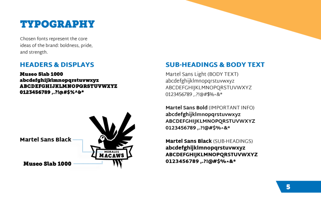
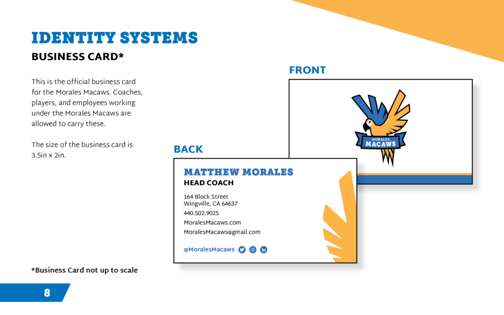
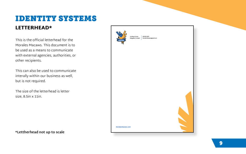
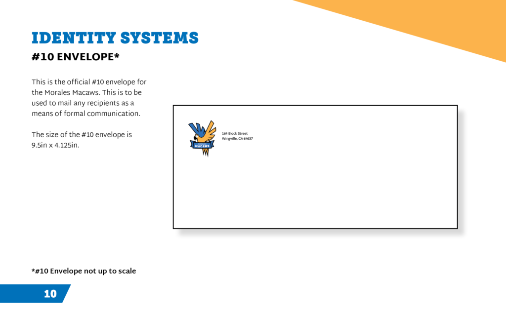
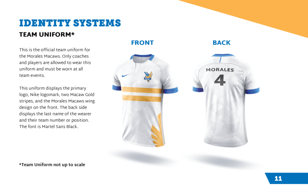
The chosen typography also represents the core ideas of the brand: boldness, pride, and strength. Museo Slab and Martel Sans are the only fonts used, but are versatile enough to be used in any situation within this high action sport. The rest of the brand identity system continues to convey those core ideas with its blue and gold color scheme and golden wing graphics. Such features are included in the letterheads, envelopes, business cards, and team uniforms in order to make the brand coherent.